
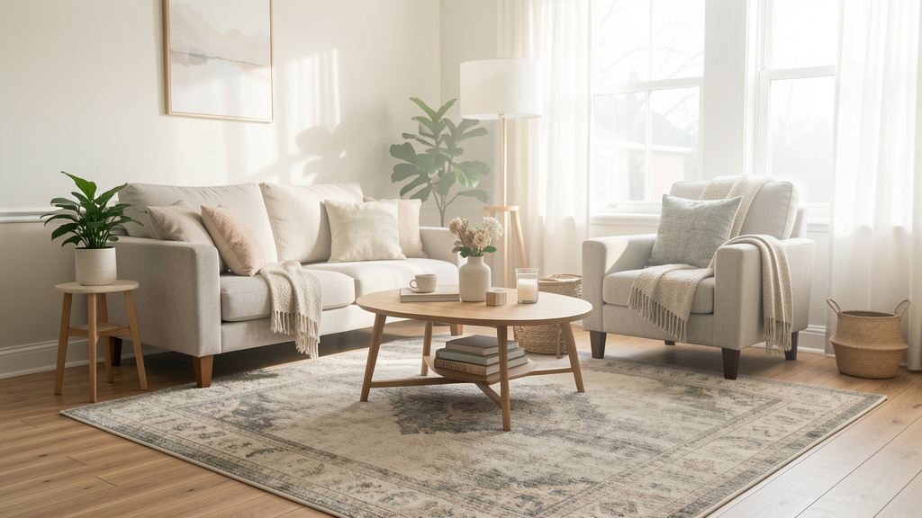
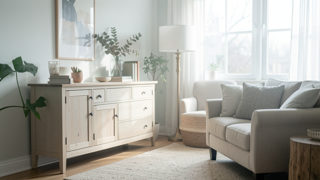
The $30 Fix: Turning a Junk Drawer into Boutique Storage
A case study on transforming a cluttered kitchen catch-all into a cohesive display using uniform acrylic dividers that mimic high-end retail.
By Beatriz Costa · 7 min read
Guides, comparisons, and short explainers on practical interior styling and home decor on a budget — written for readers who want to understand and decide, without filler.
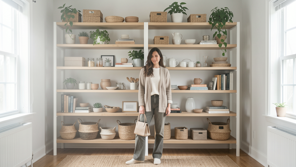 5 Styling Rules for Open Shelves That Don't Require Dusting Every DayDiscover how to hybridize your open shelving with closed storage solutions to maintain that airy aesthetic without becoming a slave to the feather duster.


A case study on transforming a cluttered kitchen catch-all into a cohesive display using uniform acrylic dividers that mimic high-end retail.
By Beatriz Costa · 7 min read

Moving beyond the rainbow trend requires understanding why spectral organization often creates visual noise rather than harmony in a lived-in home.
By Beatriz Costa · 6 min read
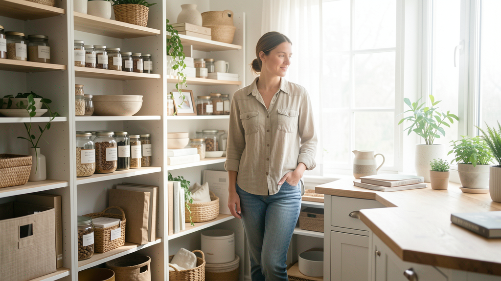
Eliminate the visual noise of crooked pantry labels by using a physical tape grid system that guarantees professional alignment on any budget.
By Beatriz Costa · 7 min read

Stop storing clutter in plain sight. Here is why woven baskets outperform clear bins for visual calm and how to source them without breaking the bank.
By Beatriz Costa · 7 min read
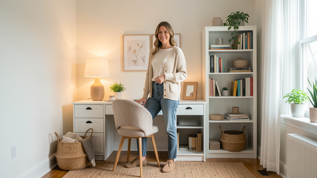
Turn an unused hallway nook into a fully functional workspace using only modular shelving units that dismantle in minutes when your lease is up.
By Lucas Oliveira · 7 min read

Manufacturing organic shapes creates excessive waste, but this upholstery foam tutorial lets you sculpt trendy decor for under $25.
By Lucas Oliveira · 5 min read
We analyzed the pile height and weave density of four coveted designer rugs to find four budget alternatives that pass the texture test.
By Lucas Oliveira · 7 min read
Achieve the coveted moody scholarly vibe of Dark Academia without draining your savings by transforming cheap paperbacks with wood stain and strategic styling.
By Lucas Oliveira · 7 min read

Discover how to curate a high-end, textural beige interior using strictly entry-level Swedish flatpacks without violating your lease.
By Lucas Oliveira · 6 min read
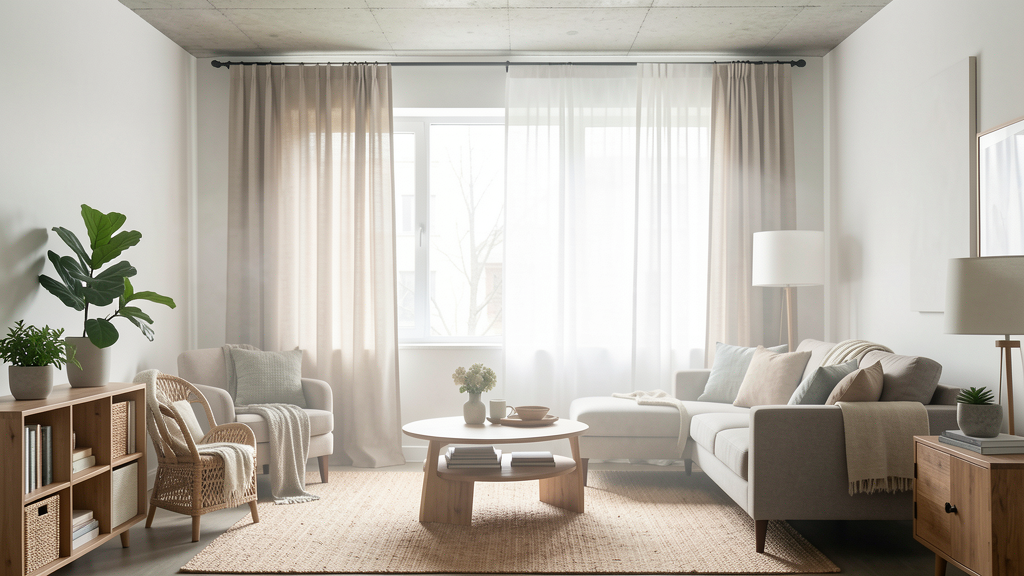
Stop fighting your landlord's window coverings and start layering them with high-end visual weight to make them disappear.
By Camila Souza · 8 min read
A technical breakdown of six removable adhesives tested for residue-free removal on drywall, plaster, and tile to ensure you leave your rental pristine.
By Camila Souza · 6 min read
Create a dreamy floor-to-ceiling canopy effect on unforgiving concrete ceilings using only tension rods and industrial-strength adhesive systems.
By Camila Souza · 8 min read
Choosing the right wallpaper material in 2026 is less about pattern matching and more about adhesive chemistry to ensure your security deposit remains intact.
By Camila Souza · 8 min read
Transform your cramped rental by using lightweight, adhesive-mounted trim to draw the eye upward and fake architectural height.
By Camila Souza · 5 min read

Stop looking at your honey oak cathedral doors with despair; swapping in 12-inch brass pulls can edit the visual weight of your kitchen without a single drop of paint.
By Beatriz Costa · 7 min read
By strategically replacing the legs, hardware, and finish of a generic MDF dresser, you can achieve a luxury aesthetic for 90% less than retail.
By Beatriz Costa · 7 min read
Stop sanding for hours unnecessarily; learn how to assess sheen and adhesion to determine when a heavy-duty primer is all you need.
By Beatriz Costa · 8 min read
Extract trapped moisture from wood finishes in minutes using a household iron and a cotton cloth, avoiding the cost and labor of full refinishing.
By Beatriz Costa · 9 min read

Learn how precise timing and a polite negotiation tactic secured a high-end designer lamp for five dollars on a Tuesday morning, avoiding the weekend rush.
By Lucas Oliveira · 7 min read

Stop losing money on curb-side finds that are structurally doomed; here is exactly how to identify particle board and cheap construction that costs more to fix than replacing.
By Lucas Oliveira · 8 min read

Learn how to furnish your entire rental apartment with unique second-hand pieces using only a compact car, strategic sourcing, and flat-pack logistics.
By Lucas Oliveira · 7 min read
Stop wasting money on particle board junk by learning the auditory and weight cues that reveal high-quality wood under layers of ugly thrift store varnish.
By Lucas Oliveira · 6 min read

I filled a 14-foot living room wall with oversized canvas art using only painter's drop cloths and furring strips for a total cost of $18.47.
By Camila Souza · 6 min read
Stop overpaying for tiny designer pots. I break down the exact 2026 costs and finish quality of mixing plaster of Paris with latex paint versus buying premade decorative brands.
By Camila Souza · 8 min read

Turn cheap, glossy vases into high-end ceramics by mixing pantry staples with acrylic paint for four distinct professional textures.
By Camila Souza · 7 min read

Achieve a high-end European wainscoting aesthetic for under $15 by upcycling delivery boxes into architectural details that defy detection.
By Camila Souza · 7 min read