Why Does Arranging Books by Color Often Look So Tacky?
Moving beyond the rainbow trend requires understanding why spectral organization often creates visual noise rather than harmony in a lived-in home.


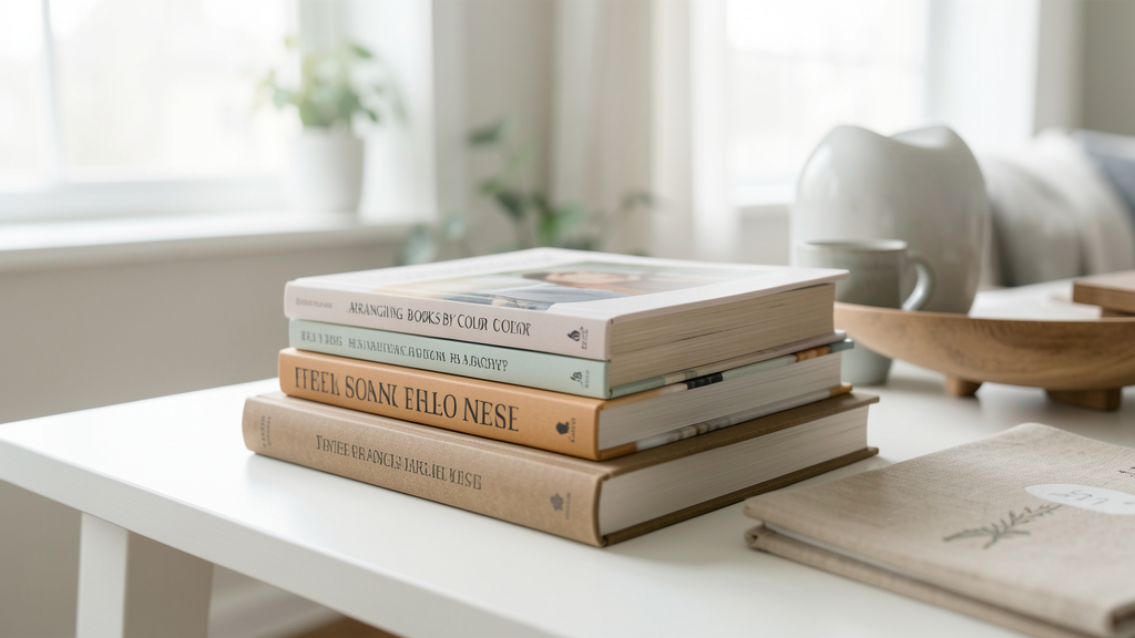
I received a frantic DM from a reader last Tuesday. She had spent her entire Sunday pulling every volume off her living room shelves, sorting them into a perfect ROYGBIV spectrum, and stepping back to admire the work. Instead of the curated sanctuary she saw on Pinterest, she felt like she was standing inside a clown’s wardrobe. The room looked louder, cheaper, and somehow more chaotic than it did when the books were just thrown together. Her question was simple: why did this aesthetic hack fail so spectacularly in her home?
The answer lies in the difference between decorating a two-dimensional screen and organizing a three-dimensional living space. While color-coded libraries are staples of design blogs and influencers' feeds, they frequently fail in real rooms because they ignore fundamental principles of visual weight and color theory. When you strip books of their context—author, genre, size—and force them into a strict chromatic line, you often create visual noise rather than harmony.
To understand this, we have to look at how our eyes process a shelf, and why the rainbow is rarely the right answer for a serene interior.
The Jarring Physics of Visual Weight
The primary issue with the rainbow method is that it disregards the physical mass of the objects. Books are not uniform blocks of color; they are rectangles of varying thickness, height, and depth. A slim poetry collection with a yellow spine does not occupy the same visual "weight" as a thick, oversized art history book with a similar yellow spine.
When you place these next to each other to satisfy a color gradient, the resulting line is jagged. The eye tries to follow the smooth transition from yellow to orange, but it stumbles over the uneven topography of the spines. This creates a vibration that makes the arrangement feel unstable. Instead of a cohesive wall of color, you get a stuttering line that draws attention to the clutter rather than the beauty of the collection.
Consider the sheer density of ink on a spine. A matte black spine absorbs light, while a glossy white spine reflects it. Grouping these together purely by hue ignores the texture and sheen, which are critical components of how we perceive color in a room. That "tacky" feeling often comes from this sensory clash—a shiny, bright red novel sitting next to a flat, dusty red biography looks accidental rather than designed. You might achieve a better sense of order by applying some of the precision logic found in The Grid System: How to Align Pantry Labels for a Custom Look, where structure dictates placement rather than just surface appearance.
Saturation Mismatches and the "Dirty" Rainbow
Color theory tells us that hues have relatives, but they also have temperatures and intensities. Most home libraries contain books bought over decades, featuring print runs from different eras. A bright, electric blue paperback published in 2024 sits aggressively next to a muted, navy blue hardcover from the 1980s. While they are technically both "blue," their saturation levels are diametrically opposed.
When you force these mismatched tones together, you create what I call a "dirty rainbow." The transitions feel jarring because the eye has to jump from high intensity to low intensity and back again within the same color family. This lack of gradient subtlety makes the bookshelf look like a jumbled pile of toys rather than a sophisticated design element. It lacks the airiness and intentionality that comes from organizing a chaotic 'junk drawer' to look like a curated boutique display, where grouping by item type and texture often supersedes color for a cleaner look.
Furthermore, the human eye finds rest in negative space and neutral tones. A strict rainbow arrangement leaves no room for breathing room. Every inch of the shelf is screaming for attention with a new wavelength of light. In a residential setting, this visual overstimulation quickly becomes exhausting. It turns the bookshelf—which should be a backdrop for life—into the main character, usually one that is wearing too much makeup.
Why Your Room Architecture Rejects the Spectrum
We must also consider the room in which these shelves live. Most interiors rely on a limited palette to create cohesion. If your living room features warm beige walls and brass accents, a shelf that transitions violently from neon purple to bright yellow introduces foreign colors that have no relationship to the rest of the space.
The rainbow shelf exists in a vacuum. It does not care if your sofa is velvet green or your rug is Persian patterned. It demands to be the only thing you look at. This creates a visual fight where the bookshelf competes with the architecture and the furniture. In high-end design, shelving is usually designed to recede or to complement the room's dominant colors. By adhering to a full spectrum, you are essentially installing a giant, loud piece of abstract art in a spot that likely requires subtlety.
There is also the issue of lighting. Warm artificial lighting at night can make cool-colored spines (blues and greens) look muddy and dark, while warm-colored spines (reds and oranges) glow disproportionately. This means your carefully arranged rainbow looks unbalanced for half the day. Styling shelves successfully requires accounting for how light interacts with objects, a nuance often lost in the flat lighting of an Instagram photo.
Tonal Grouping as the Sophisticated Alternative
If you crave the order of color organization without the visual assault of the full spectrum, the solution is tonal grouping. Instead of a line that stretches from red to violet, group your books by color families but contain them within specific zones. This allows you to manipulate the visual weight of the room.
For example, if your room feels too cold and sterile, you might group all your warm-hued books (reds, oranges, yellows) on the central shelves to act as a "fire," while keeping the cooler blues and greens on the periphery or lower shelves. This is styling with intent. You are using the books as part of the room's color palette rather than a separate, disconnected entity.
Another approach is to organize by size and vertical stacking, using color only as an accent within those parameters. Large, heavy books should anchor the bottom shelves, regardless of color. Smaller, lighter books sit on top. Within those bands of size, you can arrange by color, but the size discipline provides the structure that prevents the "tacky" vibration. This is one of the key styling rules for open shelves that don't require dusting every day; structure makes a space feel maintained and calm.
True sophistication in stylish organization often looks like a happy accident rather than a forced formula. It should look like you built a library around your favorite subjects, and the colors just happened to harmonize, rather than you treated your literature as a set of building blocks.
Finding Visual Silence in Your Shelves
The ultimate goal of styling is not to show off how many books you own or how many colors you can fit in a row, but to create a sense of peace. Arranging books by color often fails because it prioritizes the collection's aesthetic impact over the room's atmospheric needs. It creates a visual frequency that is simply too high for a relaxing environment.
If you are currently staring at a rainbow shelf that feels wrong, you do not need to undo all your work. Try breaking it up. Introduce neutral objects—white ceramic bowls, wooden boxes, or brass sculptures—between the color blocks. These act as visual palate cleansers. Or, shift from a horizontal gradient to vertical color columns, which feel more architectural and less like a spreading stain.
Ultimately, your home should feel like an extension of your personality, not a replica of a trend. If the rainbow makes you happy, keep it. But if it feels like a visual scream, trust that instinct. The most stylish shelves are the ones that know when to be quiet.
Read next

The Grid System: How to Align Pantry Labels for a Custom Look
Eliminate the visual noise of crooked pantry labels by using a physical tape grid system that guarantees professional alignment on any budget.

5 Styling Rules for Open Shelves That Don't Require Dusting Every Day
Discover how to hybridize your open shelving with closed storage solutions to maintain that airy aesthetic without becoming a slave to the feather duster.