Can You Achieve the 2026 'Quiet Luxury' Look Using Only IKEA Basics?
Discover how to curate a high-end, textural beige interior using strictly entry-level Swedish flatpacks without violating your lease.


Can You Achieve the 2026 'Quiet Luxury' Look Using Only IKEA Basics?
I stood in the textiles department of my local IKEA on a rainy Tuesday morning in March, surrounded by dozens of people frantically grabbing bright yellow shopping bags. I was not there for the standard Scandi practicality. I was hunting for a specific feeling—the kind of under-stated, beige-rich opulence usually reserved for Pinterest boards featuring Milanese lofts. The challenge was simple but daunting: could I replicate the "Quiet Luxury" aesthetic that dominated 2026 interiors using nothing but the most basic, mass-produced items on the floor?
The answer lies in a specific narrative of selection. Most renters fail at this because they confuse "minimalism" with "empty." True quiet luxury is not about having nothing; it is about having items that feel substantial, grounded, and tactile without screaming for attention. When you are working with a budget that barely covers a sofa, you cannot buy quality materials. You have to buy the illusion of quality through editing. I spent three hours that morning testing fabrics, stacking ceramics, and visualizing how particle board could mimic stone, all while keeping my rental lease restrictions firmly in mind.
The Architecture of Beige
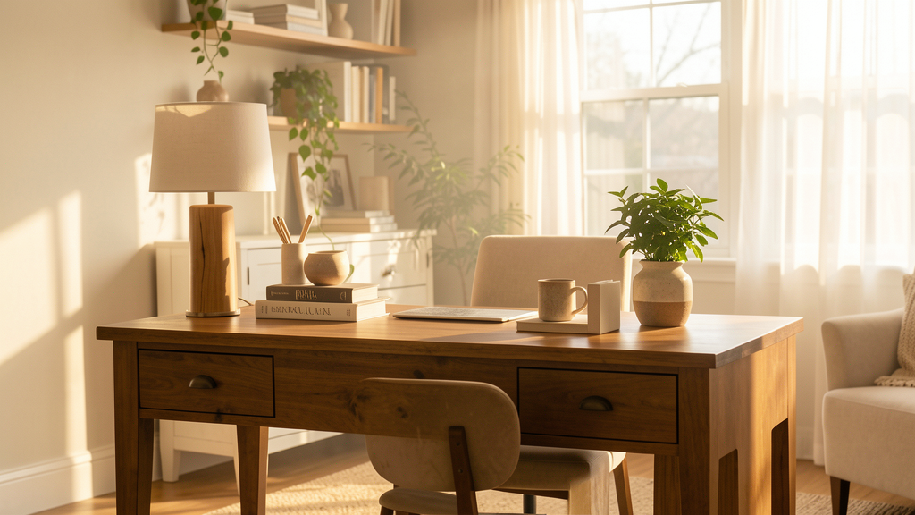
The core philosophy of quiet luxury in 2026 is neutrality, but not the flat, sterile gray-beige of a decade ago. We are looking for warm, earth-based tones—oatmeal, camel, undyed linen, and unbleached wool. At IKEA, the color palette is overwhelming, but if you filter out anything with a pigment saturation above 20%, you are left with a surprisingly cohesive collection.
I found that the key to the "billionaire" trend is what I call the "Texture Sandwich." You need a hard, cool material (ceramic, glass, or metal) to bookend a soft, warm material (cotton, wool, or wood). The visual interest comes from the contrast in how light hits these surfaces, not from colors clashing.
The biggest mistake I see budget decorators make is buying matching furniture sets. A room where the coffee table, TV unit, and bookshelf are all the same shade of "oak effect" reads immediately as discount. I bypassed the living room sets and went straight to the shelving units. The KALLAX series is ubiquitous, but laid on its side with the LACK table placed next to it, the varied heights break the visual monotony. By draping a heavy, textured throw over the exposed particle board edges, you hide the tell-tale cardboard cross-sections that scream "flatpack."

The $150 Textural Stack
To prove the concept, I limited myself to a strict budget of $150 for soft furnishings and accessories. This is where the magic happens. You can change the vibe of a room without spending a fortune on structural pieces. I picked up the PÅRUP throw blankets in a dark, warm beige. These are not cashmere, obviously—they are acrylic—but the weave is tight enough to pass for high-end wool from a distance, and they are machine washable, which is a non-negotiable factor for my lifestyle.
Layering is non-negotiable here. I placed three cushion covers on the sofa. Two were the TEODORES covers in a sand-colored linen-look fabric. The third was a darker, contrasting textured cover, the GURSKEN, which mimics the look of heavy nubby grain. The mix of weaves—smooth linen-look against rough nubby cloth—tricks the eye into thinking you sourced these from different high-end boutiques rather than the same bin.
Lighting plays a massive role in quiet luxury. The trend relies on shadows as much as light. I avoided anything with a visible plastic cord or a bright white shade. Instead, I grabbed the NYMÅNE lamps with their frosted glass and metal bases. When placed on a side table, they cast a diffused, moody glow that softens the cheap reality of rental apartment walls. It is the difference between a lit room and an illuminated atmosphere.
When Particle Board Feels Like Stone
One of the hardest elements to mimic on a budget is the weight of furniture. Luxury items feel heavy; they feel anchored to the floor. IKEA items often feel like they might float away. I combat this by grouping objects into "vignettes" rather than spreading them out. Clustering three items of varying heights on a coffee table creates a grounded moment that distracts from the lightweight nature of the table itself.
I used the GODMORGON box to create a "tray" effect. By placing a wooden cutting board on top of it and arranging a ceramic vase and a stack of art books, I added visual density. The weight of the books grounds the flimsy box. This is a stylist’s trick—using the contents of a surface to justify the surface itself. If you cannot afford a solid walnut credenza, you make the particle board version look like a curated gallery display.
For those willing to put in a little extra effort outside the blue and yellow walls, I often recommend finding a vintage piece to anchor the room. The contrast between the pristine, modern basics and a worn-in vintage item adds that layer of "old money" history. If you are worried about transport logistics, don't be. I’ve debunked the idea that you need a massive car to furnish your home; you can find excellent vintage pieces without a truck if you are strategic. However, if you stick strictly to the IKEA script, the "old money" vibe must come entirely from styling.
The Reality of the Substitution
I must be honest about the trade-offs. While the aesthetic is spot-on, the longevity is not. A $400 coffee table from a design brand will last twenty years; a $40 IKEA table will start to wobble after two moves. The fabric on the budget cushions will pill faster than high-end linen. You are paying for the look of the moment, not the heirloom quality of the past.
However, for a renter in 2026, this might actually be a feature, not a bug. Our living situations are fluid. Investing thousands in a rigid aesthetic that might not fit your next apartment is risky. Using IKEA basics allows you to participate in a high-end trend for the cost of a few nice dinners out. When you eventually move or the trend shifts, you haven't mortgaged your future on a beige sofa.
There is also a limit to what paint and particle board can hide. If you run your hand over the VITTSJÖ shelving unit, you know it is metal and glass, not brushed brass and antique mirror. But styling is about what you see from the sofa, not what you touch up close. It is about the silhouette against the wall, the play of light on the ceramic vase, and the calm feeling of a monochromatic palette.
Silence as a Design Tool
Ultimately, quiet luxury is about the absence of noise. By restricting myself to a single store and a tightly curated color palette, I removed the visual noise of clutter and mismatched eras. The room stopped shouting. The beige tones act as a visual white noise, allowing the mind to rest.
If you feel the urge to add a pop of color, resist it. If you want to hang a gallery wall, choose simple black and white frames with thick white mats. The discipline of the edit is what makes this look expensive. It is incredibly difficult to make a room look expensive by adding things; it is much easier to make it look expensive by taking things away, or in this case, only choosing things that know how to behave.
By treating these basic items with the respect usually reserved for antiques—arranging them carefully, keeping them free of clutter, styling them with intention—you elevate them. They become props in a narrative of calm. You do not need a trust fund to achieve the 2026 quiet luxury look; you just need the patience to curate the beige.
Read next
Can You Actually Transform a $30 Roadside Dresser into a Designer Credenza?
By strategically replacing the legs, hardware, and finish of a generic MDF dresser, you can achieve a luxury aesthetic for 90% less than retail.

Myth: You Need a Large Vehicle to Furnish Your Home with Thrifted Finds
Learn how to furnish your entire rental apartment with unique second-hand pieces using only a compact car, strategic sourcing, and flat-pack logistics.