A Gallery Wall Planning Grid for Non-Designers
Plan a gallery wall with paper templates, anchor lines, and spacing rules before making holes in the wall.

By Claire Watanabe · May 29, 2026 · 4 min read
The fastest way to improve hallway wall is not to buy the most dramatic object. It is to understand the small visual decision that keeps repeating in the room. In this case, the recurring issue is simple: frames look balanced on the floor but drift too high, too wide, or too random once mounted. When that friction is ignored, the room can be technically furnished and still feel unfinished.
This guide treats A Gallery Wall Planning Grid for Non-Designers as a practical design system for real homes. It is written for renters, busy households, and readers who want a better-looking room without turning the house into a showroom.
Start with the visible friction
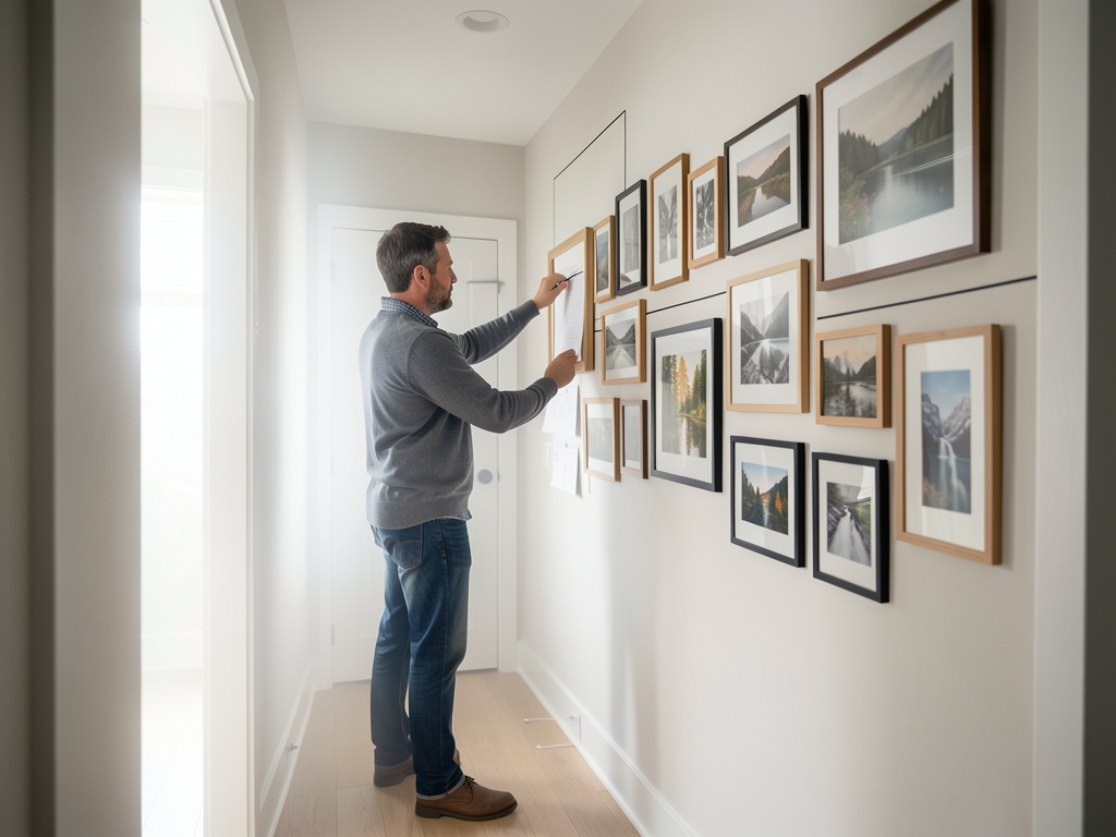
Stand at the doorway and notice what your eye reads first. Do not begin with a shopping list. Begin with the visible friction: anchor line, outside rectangle, frame spacing, art weight, and sightline. In an ordinary hallway wall, those details decide whether the space feels calm, intentional, or visually noisy.
A useful first pass takes ten minutes. Remove the objects that are clearly out of place, then put back only what supports the room’s job. If the room still feels wrong after that edit, the issue is probably proportion, light, color rhythm, or storage logic rather than the number of objects.
The field test
| Decision point | What to check in this hallway wall | Practical move |
|---|---|---|
| Main friction | Frames look balanced on the floor but drift too high, too wide, or too random once mounted | Name the friction before changing objects. |
| Visual anchor | Anchor line, outside rectangle, frame spacing, art weight, and sightline | Use it as the rule for what stays visible. |
| Materials | Kraft paper templates, painter tape, pencil, tape measure, and mixed wood and black frames | Repeat two or three materials instead of adding more categories. |
| Review signal | Whether the wall reads as one composition from the room entrance | Revisit the setup after one ordinary week. |
The field test matters because a room is not evaluated only in a finished photograph. It has to work during a rushed morning, a quiet evening, and a normal reset. For a gallery wall planning grid for non-designers, the most useful signal is whether the wall reads as one composition from the room entrance. If the answer is no, simplify the system before adding a new piece.
Build the change in layers
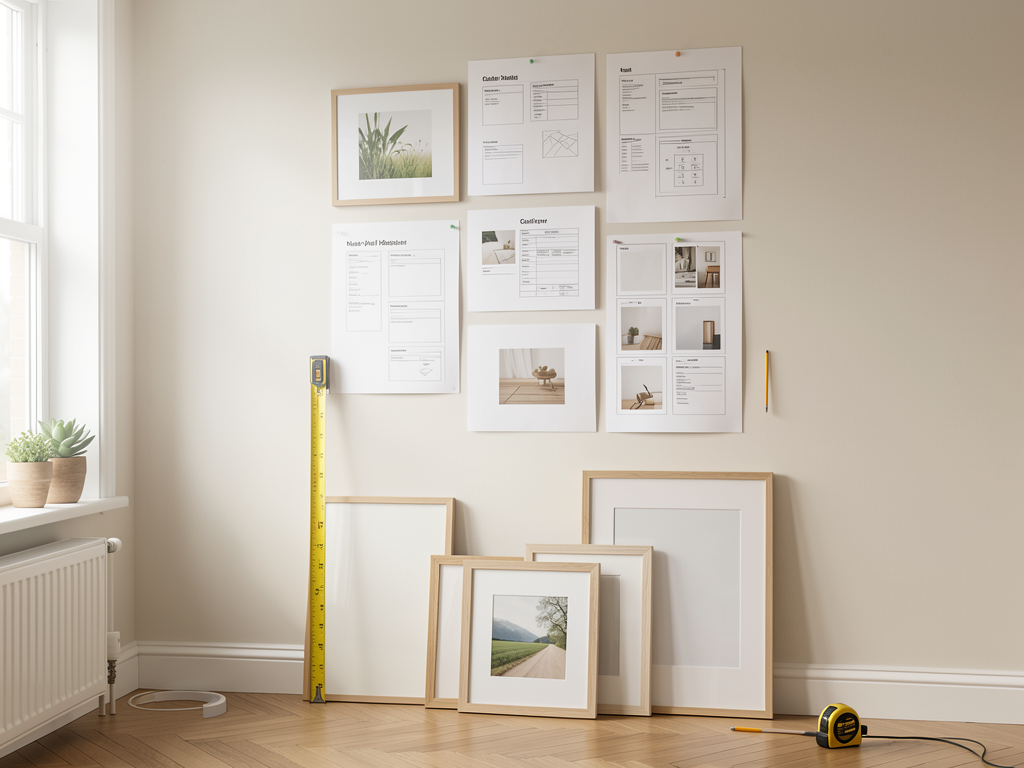
Work in three layers. First, decide what must remain visible for the room to function. Second, choose which visible items deserve better alignment, repetition, or spacing. Third, add one detail that makes the result feel deliberate. For this room, the most reliable materials are kraft paper templates, painter tape, pencil, tape measure, and mixed wood and black frames.
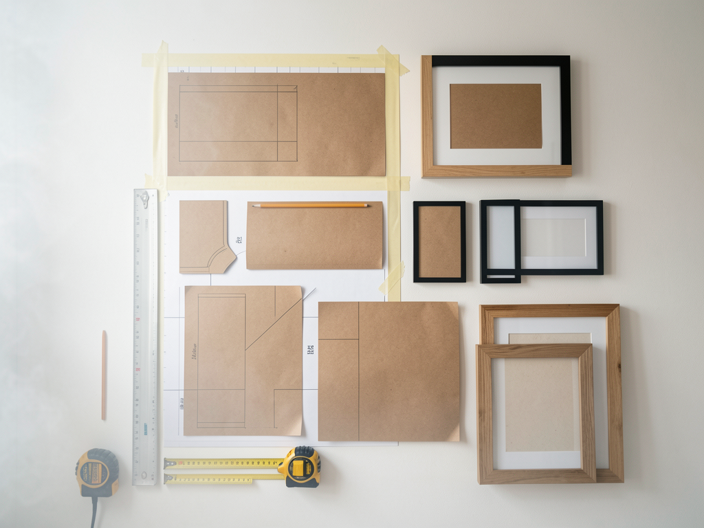
The practical move is this: commit to the outside rectangle first; the inner variety can be looser after the boundary is clear. That sentence should guide every small decision. If an object does not support the sentence, it either needs a better place, a calmer container, or a reason to leave the room entirely.
A realistic example
Imagine the room on a Thursday evening, not on a styling day. Someone enters, uses the space, drops one item, adjusts the light, and leaves. A fragile design collapses immediately. A useful design absorbs that ordinary behavior because it gives common objects a clear place and gives the eye a clear rhythm.
In a hallway wall, the rhythm usually comes from repeated material, consistent spacing, and one visible anchor. The anchor does not need to be expensive. It can be a lamp, a tray, a textile, a frame line, a rug edge, or a storage boundary. What matters is that the same visual rule appears more than once.
Mistakes to avoid
- Do not copy a room from a photo without checking your own light and fixed finishes.
- Do not add containers before deciding what should stay visible.
- Do not solve a proportion problem with more small decor.
- Do not judge the result only from close up; step back to the doorway.
- Do not keep an arrangement that looks good but takes too long to reset.
Maintenance rule
Give the change a one-week review. If the setup still works after normal use, keep it. If the room slowly returns to visual noise, the system is too delicate. Reduce the number of visible categories, repeat one material more clearly, or move the most distracting item behind a closed front.
Related reading
Continue with A Coffee Table Vignette Formula That Does Not Feel Staged, A Shelf Styling System for Real Life, The Three-Layer Lighting Checklist. Those guides approach the same home from nearby decisions, so the room can improve as a connected system instead of a collection of unrelated fixes.
Final takeaway
A Gallery Wall Planning Grid for Non-Designers works when the room becomes easier to read and easier to reset. The goal is not a perfect interior. The goal is a home that communicates care, supports daily use, and still feels like people live there.
Read next
A Coffee Table Vignette Formula That Does Not Feel Staged
Build a coffee table composition that leaves space for real life while still giving the room a finished center point.
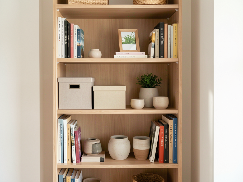
A Shelf Styling System for Real Life
Style shelves around actual storage needs with anchors, repeats, and a maintenance rule that prevents weekly restaging.
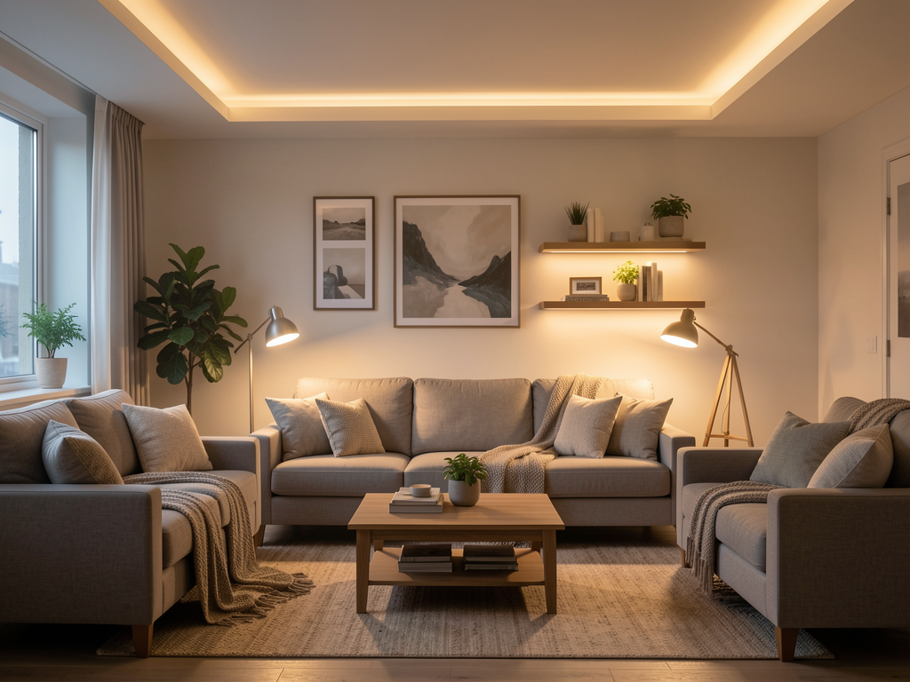
The Three-Layer Lighting Checklist
Audit ambient, task, and accent lighting so a room works for chores, conversation, and evening atmosphere.