How to Build a Palette From One Fixed Finish
Start with the one thing you cannot change—floor, countertop, or built-in—and test undertones before committing to new colors.

By Elena Morris · June 10, 2026 · 5 min read
The fastest way to improve kitchen palette is not to buy the most dramatic object. It is to understand the small visual decision that keeps repeating in the room. In this case, the recurring issue is simple: new paint or cabinets look wrong because they fight the fixed finish that cannot move. When that friction is ignored, the room can be technically furnished and still feel unfinished.
This guide treats How to Build a Palette From One Fixed Finish as a practical design system for real homes. It is written for renters, busy households, and readers who want a better-looking room without turning the house into a showroom.
Start with the visible friction
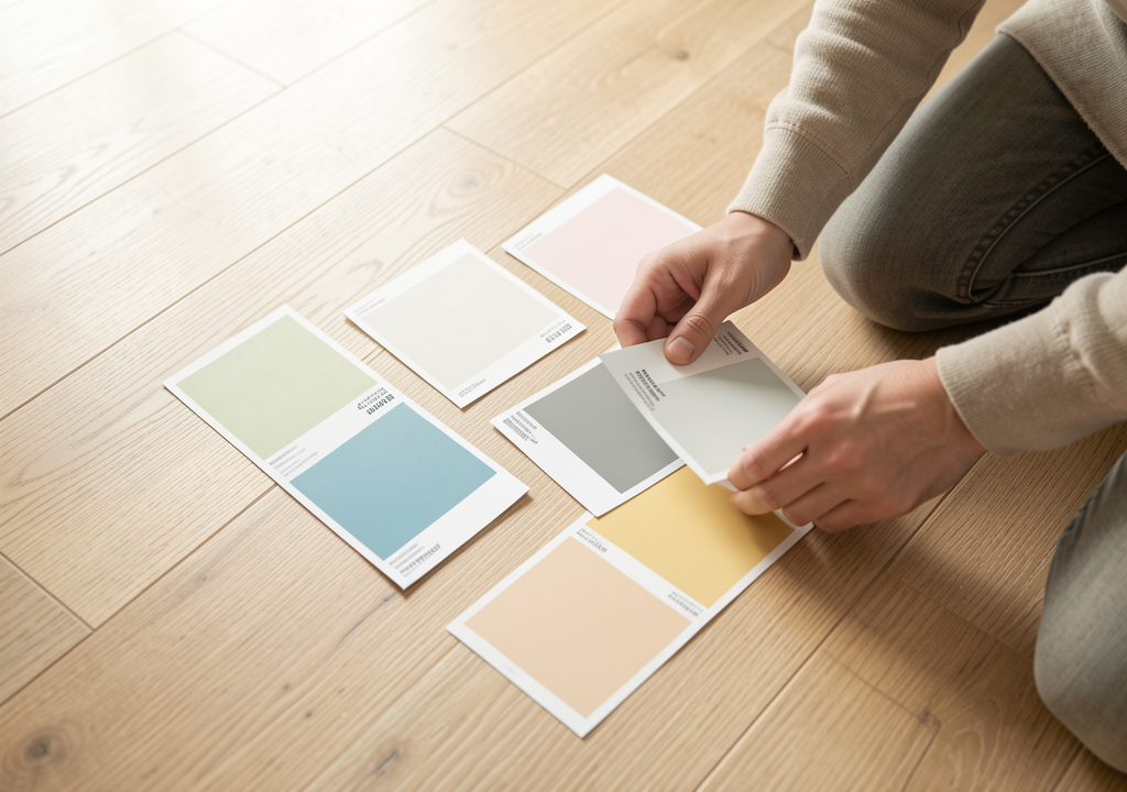
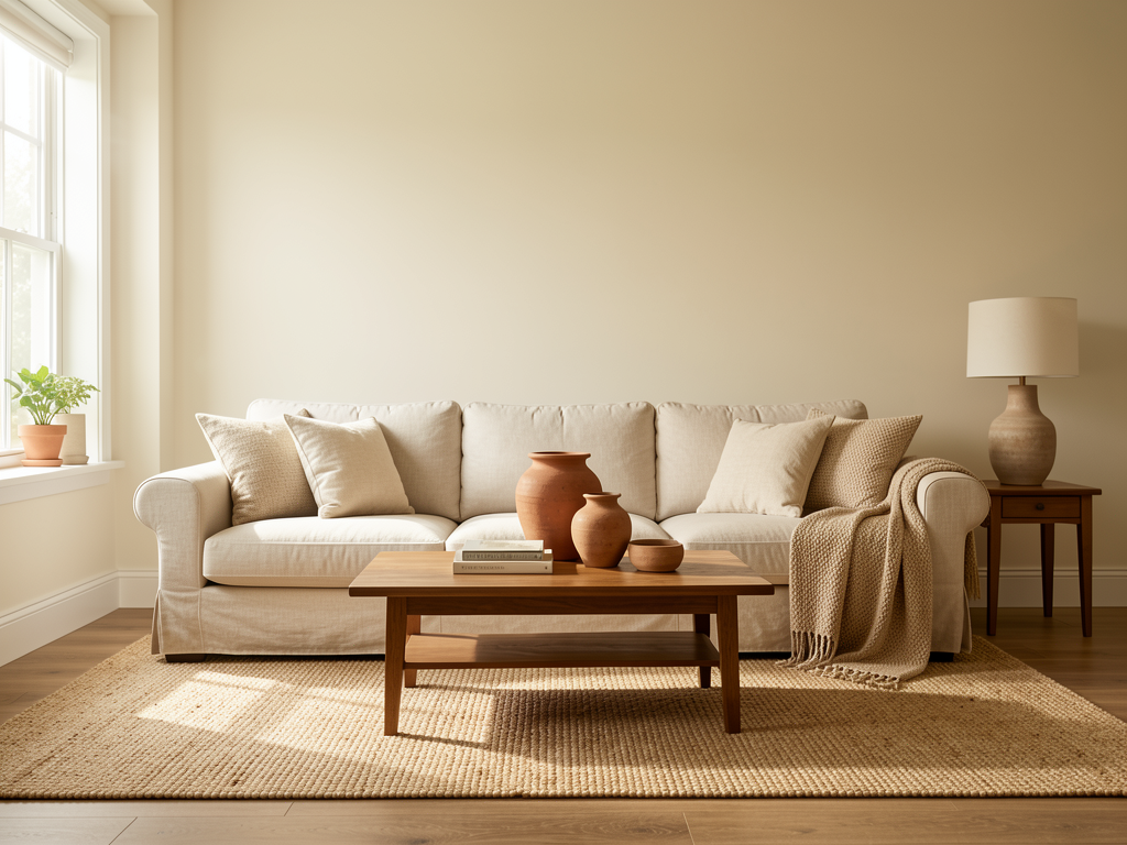
Stand at the doorway and notice what your eye reads first. Do not begin with a shopping list. Begin with the visible friction: the fixed finish, its undertone, the light at noon and evening, and any new material you are considering. In an ordinary kitchen palette, those details decide whether the space feels calm, intentional, or visually noisy.
A useful first pass takes ten minutes. Remove the objects that are clearly out of place, then put back only what supports the room's job. If the room still feels wrong after that edit, the issue is probably proportion, light, color rhythm, or storage logic rather than the number of objects.
The field test
| Decision point | What to check in this kitchen palette | Practical move |
|---|---|---|
| Main friction | New paint or cabinets look wrong because they fight the fixed finish that cannot move | Name the friction before changing objects. |
| Visual anchor | The fixed finish, its undertone, the light at noon and evening, and any new material you are considering | Use it as the rule for what stays visible. |
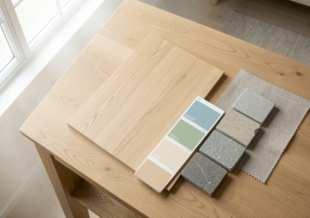
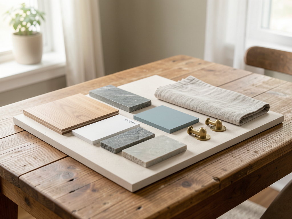
| Materials | Photo of the fixed finish, white and cream paint cards, warm and cool stone samples, and a neutral textile swatch | Test undertones by placing them next to the fixed surface. |
| Review signal | Whether the new materials still look intentional in morning, noon, and evening light | Revisit the setup after one ordinary week. |
The field test matters because a room is not evaluated only in a finished photograph. It has to work during a rushed morning, a quiet evening, and a normal reset. For how to build a palette from one fixed finish, the most useful signal is whether the new materials still look intentional in morning, noon, and evening light. If the answer is no, simplify the system before adding a new piece.
Build the change in layers
Work in three layers. First, identify the fixed finish and its dominant undertone—warm, cool, or neutral. Second, gather paint cards and material samples that either harmonize with that undertone or provide intentional contrast. Third, test them next to the fixed surface in actual room light before making any purchase. For this room, the most reliable materials are a photo of the fixed finish, white and cream paint cards, warm and cool stone samples, and a neutral textile swatch.

The practical move is this: test undertones by holding samples next to the fixed surface in three different light conditions. That sentence should guide every small decision. If an object does not support the sentence, it either needs a better place, a calmer container, or a reason to leave the room entirely.
A realistic example
Imagine the room on a Thursday evening, not on a styling day. Someone enters, uses the space, drops one item, adjusts the light, and leaves. A fragile design collapses immediately. A useful design absorbs that ordinary behavior because it gives common objects a clear place and gives the eye a clear rhythm.
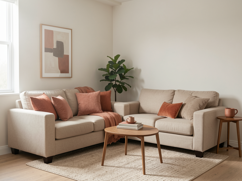
In a kitchen palette, the rhythm usually comes from undertone harmony, not from matching exact colors. The anchor does not need to be expensive. It can be a paint color that pulls from the floor, a backsplash that bridges countertop and cabinets, or a textile that reads well in all light conditions. What matters is that the same visual rule appears more than once.
Mistakes to avoid
- Do not assume wood is warm or stone is cool without checking the specific sample.
- Do not choose paint at night under warm bulbs and expect the same result in daylight.
- Do not skip the step of testing samples next to the fixed finish.
- Do not add too many competing undertones in one room.
- Do not trust paint names—swatch in the room before committing.
Maintenance rule
After a week, if the palette still feels balanced in both daylight and evening light, keep the swatch choices. If something feels off, test one more option for the piece that bothers you most rather than redoing the whole room. A palette settles when it has enough time to be seen in different conditions.
Related reading
Continue with Choose an Accent Color That Will Age Well, The Two-Color Rule for Rental Apartments, A Warm Neutral Palette That Still Has Depth. Those guides approach the same home from nearby decisions, so the room can improve as a connected system instead of a collection of unrelated fixes.
Final takeaway
How to Build a Palette From One Fixed Finish works when the room becomes easier to read and easier to reset. The goal is not a perfect interior. The goal is a home that communicates care, supports daily use, and still feels like people live there.
Read next
Choose an Accent Color That Will Age Well
Use fixed finishes, daylight, textiles, and repeatable accents to choose a color that survives more than one season.
The Two-Color Rule for Rental Apartments
Create a calmer rental palette by repeating one base color and one accent across textiles, art, and portable objects.
A Warm Neutral Palette That Still Has Depth
Build a warm neutral room with value contrast, texture, and undertone control so it feels layered rather than flat.